Taking a New Look at the Account Pages
One of the things we’ve been keen to do for a while is re-assess presentation of the “My Account” pages in Prism 3. This has been dependent on another piece of work, improvements to the Local Data Services (LDS) that pass information back to Prism 3 from your local LMS. This does mean that some of these modifications are dependent on installation of the newer LDS at your site.
Reasons for the Changes
One of the most requested additions to Prism 3 was the Loan History, we’re going to add this, but we’re also taking the opportunity to look at how we deliver account information overall.
Similarly to how we approached the availability redesign earlier in the year, what we wanted to focus on was:
- How can we make the complex data as people-centric as possible?
- How can we make the common tasks easier?
- How can we make the information easy to comprehend?
So in this post, we’ll take a look at some of the concepts we’re working with. Please do provide feedback and remember these are mockups rather than final designs so subject to change. Also, it’s worth remembering that these are defaults that can be over-ridden by custom css or interface labels. We’ll also be looking at further changes earlier next year as part of the “improvements to my account efficiency” roadmap item.
Breaking the Data into Manageable Chunks
Our first task with the account pages of Prism was to break the data into more manageable, compartmentalised chunks. Currently everything about an account appears on one page, and this will get pretty big, pretty fast, so we wanted to move each section of my account to its own sub-page.
This means each task has its own context to work in resulting in pages for:
- Current Loans
- Charges
- Reservations
- Bookings
- Loan History
- Inter Library Loans
There’s been some discussion on how this is to be split up, with the issue of whether Bookings and Reservations are different enough in the minds of library users. Currently we’re erring on the side of keeping them separate, but we’d be interested in your thoughts on this.
The Account Summary
At the top of the accounts pages we’ve realigned the summary details, in much the same way as we did with availability, to be simple statements making for a more “human” page. We’ve also made it persist through the various account pages, acting as a “notifications area” to summarise items that need action (reservation pickups, charges and so on). We’ll also use this area for confirmation of actions.
![]()
A subtle change here is that the charges indicator contains the total including currently accruing fines, where previously these were only shown as part of the loans (something that confused users).
Beneath the summary, the navigation between the various sections of the account pages will be by mini-tabs. This is a nice simple metaphor for this type of content, allowing easy movement between the various sub-sections along with highlighting current location.
Current Loans
Here we’ve put the information that the majority of users need most of the time and made it the default page when you log in. We’ve taken a look at the Google analytics and the common paths involve going in and renewing, so we want to make this as easy as possible. So we’ve added a “renew all” button, to speed the most common use case, that of “I can’t get to the library, so need to renew all my current loans”.
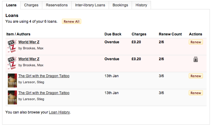
We’re improving this by adding in the jacket image and a link to the item in question. We’ve also removed some of the detail that really isn’t needed by most users: item ID and control number. This was a hard choice, but scenarios in which these would be useful are fairly limited in this context.
A useful piece of feedback we got from libraries was that showing the renew count out of a total would be really useful, so we’re hoping to add this too.
We’re also adding in several cues as to the state of individual items. We’re looking at several options for the exact nature of this display. The one shown above is a simple enhancement to the existing tables. Where an item is overdue it turns a shade of red and bolded.
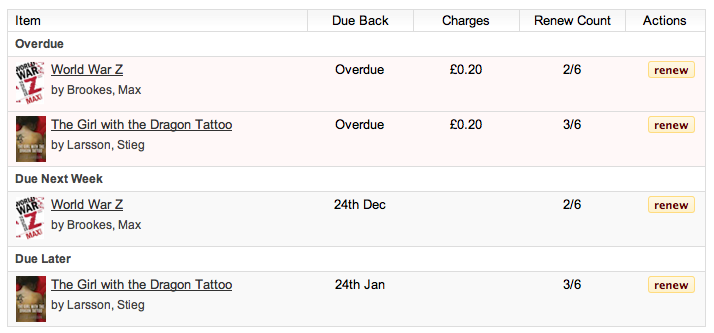
The second option is adds an additional collation of items so that common dates act as headings (much like an email client might). So you can see “overdue”, “due back this week”, “due back this month” and “due later” to help as a cue for what needs attention now.
Loan History
The Loan History pages have the potential to contain a huge amount of data, especially if a library user has had an account for several decades and borrowed books every few weeks in that time. Thus the Loan History page needs to be broken down into manageable chunks.
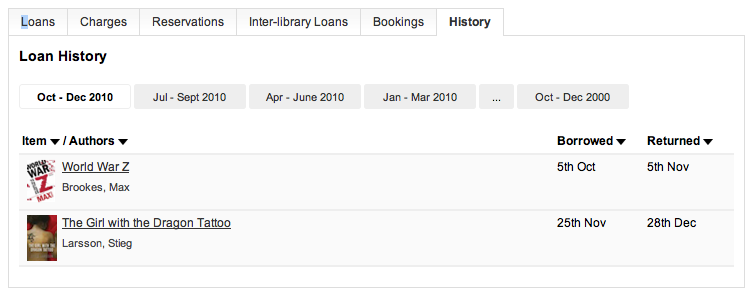
The history can be re-ordered by the title, main author and loan dates; each version of the navigation provides its own paging mechanism.
Reservations, Bookings and Inter-library Loans
Although the concepts may be different, the mechanics of checking these three elements online are very similar, so the interfaces here differ only in the labels.
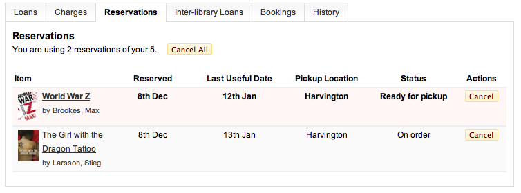
Again, the basic changes are to add in the book covers, links to the books and highlighting of common actions. A simple statement of entitlement is an element we hope to add to allow people to manage their account more efficiently and again we’ve added a cancel all button.
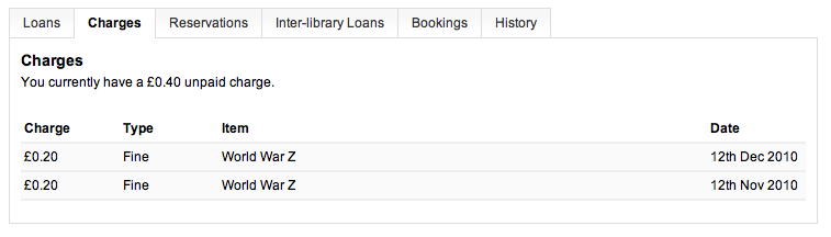
Charges
The charges page has only a few minor improvements. We’ve included the summary and with the improved LDS service we can fix the missing accrual date problem. As mentioned earlier, the totals now represent the current total owed, including currently accruing items.
Next Steps
The key aim of this work is to add in the loan history work, break the account pages into manageable chunks and integrate it more completely into the rest of the product. Although it mainly addresses the “Loan History” roadmap item it also paves the way for future work including the “improvements to my account efficiency” item.
Please do let us know if there are issues we haven’t considered either here or via email.

December 13th, 2010 at 4:45 pm
I’ve flown this past a couple of public-facing colleagues and they’ve been very positive – “Basically – yes to everything”. I like it too, think it is very clear. And it will be such a relief to have borrower history back – as my colleague said, “didn’t realise how much customers would miss it (until they started telling us)”.
A couple of specific requests though:
(1) “One thing about the renew all button (which is a good idea) – it would need to highlight clearly in the process any items which are not/can’t be renewed.”
(2) “Will reserved items be highlighted? Currently, the only way a customer knows an item is reserved is when they go to renew it and are blocked from doing so. It would be really useful and customer friendly if people were notified when an item they have has been reserved. I know we can send a recall when we manually reserve items but it’d be good if that information was also highlighted in the account summary at the top of the page. That way they’d know that it couldn’t be renewed and they’d bring it back on time (in theory).” It would be helpful if instead of giving the renew count as 2/6 (for example), it could say, “Reserved by another reader – cannot be renewed”, or something similar.
Would we be able to hide tabs we didn’t want to display? For example, we don’t use Talis for ILL (but we do offer an ILL service). Someone looking at the ILL tab and not seeing their requests will be baffled. Equally, we don’t use bookings.
But overall, we really do like it!
December 13th, 2010 at 5:01 pm
Hi Heather,
yes, we’re keen to make sure that if any items fail to renew we flag it clearly and explain why. As you rightly say, this is particularly important with the renew all function as we don’t want people to assume a transaction went though that didn’t.
On reserved items, we’re hoping to have the mechanics in place to flag items as not renewable due to reservations or reaching renewal limits. In fact the padlock icon in the screenshot above is for that purpose (though this isn’t finalised, text may be better).
As mentioned in the Development Webinar, if you don’t use particular features it will be possible to disable or hide them via CSS.
December 20th, 2010 at 3:02 pm
Hi Matt
We are still on Prism 2.1 but taking a keen interest in Prism 3 for the future. There’s a defect in Prism 2.1 that means that potential fines (fines accruing) on recalled loans don’t display. It shows as £0.00 even when they exist in Alto. Do you know if this is fixed in Prism 3? If so, showing the fines accrued and accruing will be great. If not, it’s an issue because we already have repeated ‘debates’ with students who argue that the Prism 2.1 display is misleading.
January 5th, 2011 at 11:41 am
Hi Claire,
Prism 3 pulls this data in from the local system using the LDS web service, so the calculations will be those used there. That code will be undergoing considerable redevelopment to enable the account work, so we’ll check that this bug is not replicated there.
January 26th, 2011 at 2:31 pm
Hello Matt,
Not sure if it’s too late to comment but thought I would try anway. Our feedback from the front line asked for two things: one that overdue items were more clearly differentiated pink shading was considered not quite striking enough (red writing was mentioned). The other was for more explanation and help when a user couldn’t renew or reserve an item e.g.
Unable to renew – fines exceeding £10 limit. Pay fines?
Unable to renew – item reserved by another borrower. Place new reservation?
Unable to renew – maximum no of allowed renewals reached. Please return books to library asap.