Admin Console Release – 18 December 2014
We’re pleased to announce that the latest release of the Admin Console is now live.
This release includes:
- Prism:
- Redesigned editor for Prism themes
- Notifications
- Ability to schedule a “one-off” rule
- Validation of mandatory fields when adding a rule
- Adding name of rule to deletion modal dialogue
- Rule parameters multiple value selection now uses a control with ability to move values into and out of a ‘selected’ box
- Improvement to notifications editor to stop the page jumping around in certain browsers
Prism – Theme Editor
We’ve re-organised the Prism Theme editor in this release, and at the same time added some features to make it easier to manage and experiment with themes.
The most noticable difference is the adoption of a ‘tabbed’ interface, allowing us to move the ‘Upload File’ and ‘Upload Zip’ forms from the bottom of the page, making them quicker to access. Alongside these existing options, we also have three new features: ‘Edit File’, ‘Create File’ and ‘Migrate Theme’.
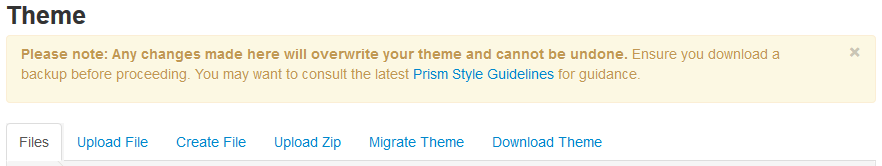
We’ve also added a link to the latest revision of the Prism Style Guide into the alert at the top of the page. You can now also dismiss this alert for the remainder of your session by clicking the “x” in the top right corner.
Edit File
To make it quicker and easier to try out new styling in your theme, we’ve added the ability to edit your files in situ. The editor we’ve chosen works on modern browsers (IE8 and up, recent Firefox and Chrome versions), and offers a wealth of features tailored to working with CSS, HTML and JavaScript files. These include:
- Autocomplete: as you type CSS property names, JavaScript method names or HTML tags, the editor suggests possible values.
- Smart indentation: the editor knows about the best way to indent CSS, Javascript, HTML and XML, and will do this automatically when you press enter to go to the next line.
- Warnings/errors: CSS rules that could be problematic, or syntax errors in other files, are highlighted with either a warning flag, or an exclamation mark depending on the severity.
- Find/replace: when using the editor, pressing CTRL-F or CTRL-H opens a find and/or replace dialogue respectively.
- Theme support: if you’d rather work with a darker background to reduce eye strain, simply select one of the dark themes. This setting is saved in a cookie and should persist the next time you use the editor.
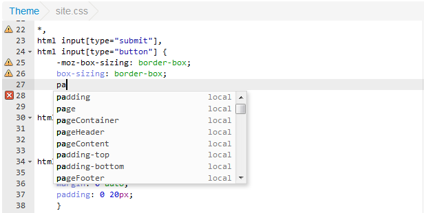
Once you’ve finished editing a file and clicked on the ‘Save’ button, simply reset your tenant cache to see the changes reflected in your theme.
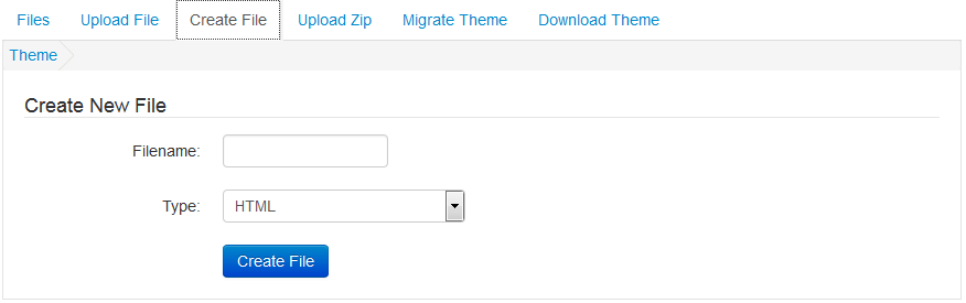
Create File
In tandem with the ability to edit files, Create File allows you to add a text based file (HTML, CSS, JavaScript, XML, .ini/config file and plain text) to your theme without the need to upload a blank file. You can create subdirectories by using forward slashes in the file name, e.g. path/to/new/file.html.
To ensure you can’t accidentally overwrite an existing file, the Admin Console checks to see whether a file of the same name already exists, and warns you if so.
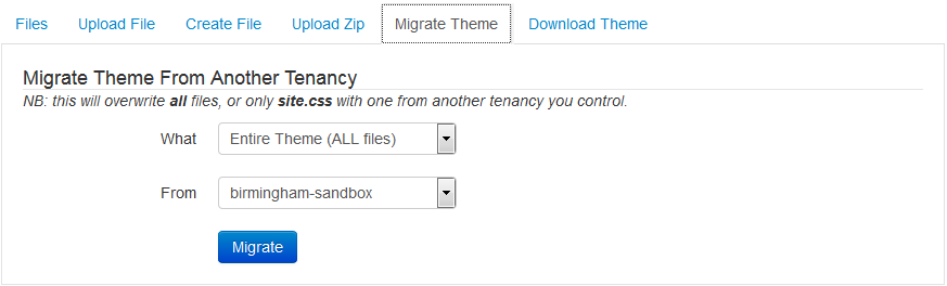
Migrate Theme
Every Prism customer has two tenancies by default, their ‘Live’ and their ‘Sandbox’. We always suggest working on any changes in your Sandbox first, before copying them to your Live tenancy. Previously this was accomplished by downloading a theme backup from the Sandbox and uploading it to the Live tenancy.
‘Migrate theme’ makes this process much quicker, allowing you to migrate the entire theme, or just your tenancy specific stylesheet file(s).
The usual process will now be to visit your Sandbox tenancy, migrate the theme from your Live tenancy, make changes, and then migrate from Sandbox to Live – all without having to download and edit files locally on your computer.
Notifications
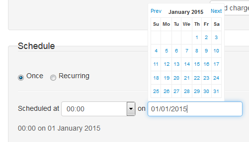
One-off Rules
We’ve now added the ability to create a special ‘one-off’ rule, that will send a notification on a specified date, rather than running on a regular basis. When adding the rule you now have the option to set the schedule to ‘Once’ or ‘Recurring’. When ‘Once’ is selected you can specify a date and time.
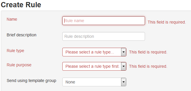
Mandatory Field Validation
When adding a rule, you’ll now be prompted with a warning message to fill in certain required fields, rather than defaults being provided which could previously be accepted inadvertently.
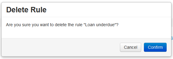
Deletion Modal Dialogue
If you have a long list of inactive rules and are in the process of cleaning them up, confirming you’re deleting the intended rule is important. To that end we’ve now added the name of the rule you are about to delete to the modal dialogue that pops up asking for confirmation.
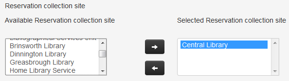
Selecting multiple values for rule parameters
We’ve had some feedback that selecting multiple parameter values when creating a rule can be a bit cumbersone, especially if you have a long list of values. We’ve now adopted a similar selection widget to that used in the Prism Facets section of the Admin Console to make this a bit easier.
Comments and contact
If you have any comments, questions or suggestions please get in touch. You can comment here on the Prism blog, on the Prism forum and Prism Ideas or contact your Account Manager or the Prism team directly.


Recent Comments